With their startling colors, jarring juxtaposition of architectural styles and emphasis on simple geometry, Michael Graves' colored-pencil drawings fixed his reputation as the highbrow jokester who built a bridge between academic architecture and pop culture.
Bristling with energy and invention, those early drawings, from the 1970s and 1980s, were expertly tossed salads of different historical styles—bulgy pillars from Revolutionary France, round-headed castles from German Romanticism, the rigid axis of the 19th Century Beaux arts—all rendered in acid colors and pushed to comic extremes. The drawings were intentional, calculated slaps in the face: The message, that Modernism was wrong headed and played out, was the war cry of the period.
Graves passed away last week at age 80.
Most disconcerting about Graves's drawings was an underlying sense of archness and preppy superiority, as if the architect himself did not take his own enterprise so seriously. That was anathema to earnest young architectural students bent on saving the world through redesign. Like Erik Satie and Salvador Dali, two other figures who often hid their anxieties behind humor, the element of snark in Graves seems like protective cover. He needed irony as a shield in case someone accused him of unseriousness. His much-quoted saying, "The dialogue of architecture has been centered too long around the idea of truth," was a cunning trap set for puritans and numbskulls.
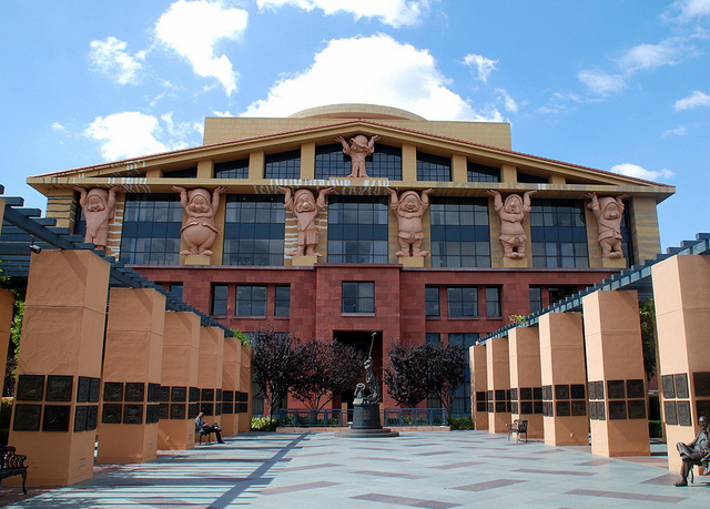
Graves made a big public impact with his buildings, including the Humana Tower in Louisville, the Portland Building in Portland, and the Team Disney building in Burbank. (In California, other buildings by Graves included the public library in San Juan Capistrano, the Kavli Building for Theoretical Physics at UC Santa Barbara, the Clos Pegase winery in Napa Valley, and the Aventine complex, including the Hyatt Hotel, in La Jolla.) I disliked those buildings when they were new. They looked like cartoons or over-sized toys, cloying in their cuteness. Graves also built a number of fine projects; my favorite is the library in San Juan Capistrano (1983), organized around a pair of parallel hallways: one path leads through a Mission-inspired façade and arrives at a hacienda style interior courtyard; another pathway, less grand in scale, leads directly into reading rooms.
Graves was also uneven. At times, it seemed he had exhausted the vein of images he had mined from the architecture of late 18th century France, particularly Ledoux, and from German Romanticism. For the Metropolis project (1990), a group of three high-rise office buildings in downtown Los Angeles, Graves proposed a trio of towers covered in meaningless decorative doo-dads. Otherwise conventional, these office buildings looked like big Christmas cookies, encrusted with cake icing, sprinkles and dried fruit. I was dismayed that he had given little consideration to the context of downtown LA. Fortunately, they were never built.
More satisfying was the big Hyatt Hotel (1990) in La Jolla. There, Graves used the cartoon technique to better advantage, using simplified, over-scaled details to maximize the visibility of the façade from the nearby freeway. The Hyatt, in fact, is a more polite variant of the notorious Swan and Dolphin Resort at Disneyworld, Florida (1985). The Disneyworld hotel boasts some features in common with the Hyatt; they include a curving roofline and the use of a stand-alone, castle-like building as an entrance pavilion. (The building type is a borrowing from the German Rundbogenstil.)
Unique to the Disneyworld resort, Graves added 47-foot statues of swans and dolphins that were calculated the raise the hackles of humorless, puritanical Modernists. The statues seemed like Graves had gone too far and broken a taboo. The taboo was not that of "taste;" the entire project is a cannonball aimed at conventional good taste. Rather, the real offense here was the unapologetic use of representational imagery in architecture with a capitol "A." In puritanical Modernism, there is no place for the human figure, Le Corbusier's famous Modulor man notwithstanding, let alone animals and plants. Like Robert Venturi and Robert A.M. Stern before him, Graves was working in an architecture of images rather than abstractions. The giant swan and dolphin may have been outrageous in scale but otherwise fit into the context comfortably.
The giant pyramid form on one of the elevations of the Disneyworld capitalizes on the power of simple geometry. Pyramids, of course, mean ancient Egypt, the mysteries of the Masons, Cleopatra movies starring Claudette Colbert and Elizabeth Taylor, the one-eyed pyramid on the dollar bill, and so on. Rather than allude to a symbol through abstraction, Graves imports the symbol itself. Whether we like the Disneyworld project or not – I admire its audacity – we should recognize that much of its power comes from simple devices (i.e. "Platonic" geometry and figurative imagery) that were commonplace to architecture prior to 1940.
One possible conclusion: Representational images are often, if not always, more evocative than abstract forms. Even the current popularity of so-called Mid-Century Modern architecture is based on the fact that these buildings, which were "abstract" when newly built and hence indecipherable to mass culture, have now been transformed by time into something familiar, that is identifiable images and symbols of American culture from another era.
If I think Graves is uneven and only occasionally successful as an architect, he also showed a way that some (if not all) qualities of historic architecture could be transferred successfully to Modern architecture. Here's a few:
- The profile or overall contour of a building is more important than its shape, because the profile, unlike the bulges of a sculptural mass, can be clearly seen from a distance.
- Round contours are often more suggestive of mass than mass itself.
- Simple geometry is the basis for architectural rhetoric. His famous tea kettle combines a triangle and a circle, while the over-cute bird figure on the spout lends an image, however coy or campy, to the whistling sound of boiling water.
- Color is admissible in architecture. Given the monochromatic tendency of most new buildings, it may even be advisable.
- Architecture needs to find a way to include figurative imagery without embarrassment.
- A combination of abstraction and figuration is possible in a single work of architecture.
- Popular culture dislikes pure abstraction. The incommunicative quality of many modern buildings makes it necessary to include figurative signage or logos to humanize otherwise uninviting structures.
So rest in peace, Michael Graves. Your legacy, however mixed, awaits re-appraisal. If you sometimes seemed sarcastic, you also raised genuine questions about the theory and practice of current architecture. In addition, you made some suggestions as to how to work around the dead ends of both a flamboyant avant garde that is hostile to its surroundings and the banal, cost-driven mainstream. So maybe you were not entirely unserious, after all.
